Interview with Matthew Morse (@heymatthew) - Penman Extraordinaire

Someone who's work and outlook (so it seems) on life that I respect is a gentleman named Matthew Morse.  I've been following Matthew on Instagram for awhile and thought it would be fun to get him on The Clicky Post as a guest and he graciously obliged.

I'll let Matthew take it away from here:

1. Tell me a bit about yourself.

I’m a graphic designer specializing in book cover design. I’m originally from Charleston, SC where I got a degree in Graphic Design and a few years experience with one of the largest ad agencies in the Southeast. I now spend my time in the tiny southern town of Sumter, SC. We have an Air Force base and a Starbucks and that’s about it. I love what I do and I love it even more when others see my work and love it as much as I do.

2. What prompted you to learn the skills you have?  Did you receive any formal training?

Funny thing about “formal training”… I originally went to school for civil engineering. I got about halfway through and into my 300-level math courses and realized that I absolutely hated math. I had a knack for photography and a student version of Photoshop and kind of got my start designing album art for local bands. Looking back now, it’s amazing anyone ever gave me a dime for that crap, but it was a start and I realized that while I hated math, I absolutely loved design and the process of creating. I switched my program and the rest is history…  

Book covers

3. How do you use your skills in your work and daily life?

As a graphic designer, I really try to go to analog tools before touching a computer. In my line of work with tight deadlines, I’m not always afforded that luxury. Especially when it comes to book covers. Regardless of how I start designs, I try to spend a little time each day putting something down on paper. Whether that be doodling or lettering or writing… It’s a way for me to disconnect from the electronic world I find myself living in 10 hours a day and clear my head through something more organic. 

Matthew's cool workspace

4. Analog tools are an obvious part of your work; what are some tools you use most? (pens, ink, paper, etc)

Right now, I’m absolutely in love with the Horizon Folded Nibs from PaperInkArts.com. At $7 each, I tend to buy them a handful at a time and just go to town. I’ve always got a couple handy and ready to scribble out an awesome quote or some such thing. They fit my style really well and give me a chance to break away from the monotony of on-screen typography.

And I have to have awesome paper to put that nib to so I typically use Rhoda No. 18 Blank Pads. They give me lots of real estate to work with and they’re relatively cheap. And the paper holds ink really well with little to no bleed through or feathering.

I’m a big fan of Iroshizuku inks. They have incredible shading and when mixed and forced to dry under high heat, you really get some special sheen from most of them. Momiji is a favorite of mine as it lays down this brilliant reddish pink but when dried, you get this amazing gold-green sheen reminiscent of Rohrer & Klingner’s Alt-Goldgrün.

I carry an Apica A6 notebook with me daily in a One Star Leather Hobonichi Cover (it’s not made for the Apica, but it works perfectly) and I always have my Nock Co. Fodderstack XL on me with a couple of pens, a notebook and some Nock Co. Dot-Dash Cards.

5. If someone wanted to work with you, how could they find you?

I can be found online at HeyMatthew.com and on Twitter and Instagram @HeyMatthew.

6. What is your favorite work you've done thus far?

It’s hard to pick a favorite, but right now I’d have to say it’s my personal website. I went for a long, long time without a proper website. I never really had an organized portfolio and I seemed to focus so heavily on my clients that my own presentation got lost in the shuffle.

Last fall, I decided to really get going on new branding and a portfolio for myself to showcase my work. So sometime early this year I officially launched HeyMatthew.com. I’m really proud of where it’s at and I think after probably 8 logos in the last 10 years, I’ve found an identity that showcases what I do best.


Special thanks to Matthew for taking the time to share his story a bit with us!  Please take some time to review his social media accounts and website.  
 

LAMY Dialog 3 Fountain Pen Review - F Nib Black Barrel

Oddly enough, the LAMY Dialog series is one that can often fly under the radar when it comes to brand recognition.  When we think of LAMY, we think of things like "Safari", "2000", or maybe even "Studio".  Dialog?  Perhaps not.

Although the Dialog series definitely fits within the realm of the LAMY aesthetic, it is probably the most unique and modern (abstract almost?) of their line up.  This helps them to stand out for sure, but also may hinder potential buyers from purchasing them; also the price tag may play a part in the decision making process...  From the collection they happen to be on the higher end of the price spectrum for the brand ranging from $130 - $385 depending on the model.  

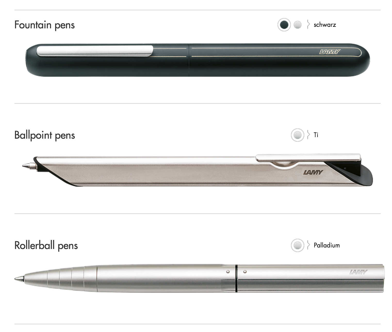
Below is an image from LAMY's website of the series:

Image from Lamy.com Website

Image from Lamy.com Website

The model that appealed to me most was the Dialog 3, the fountain pen of the series.  What makes it most interesting is that it is a retractable fountain pen.  Think Pilot Capless or Vanishing Point, but with a very distinct LAMY-esque flair.

As it should, the Dialog 3 comes in some pretty nice packaging.  You are greeted first by a matte black, thick craft box with a glossy "LAMY" logo etched on the top wherein you find a little wood looking clamshell capsule that is sleek and slim.  It almost doesn't look big enough to hold a good sized fountain pen at first.  Held closed by magnets, once opened the pen is resting in some smooth channels (no padding) and the inside is adorned with the model name and designer.  

Classy I think.  Definitely not a throwaway type of packaging.

The first thing you notice about the pen when taking it out is how big it is.  No doubt, it is a large pen.  From a measurements perspective, it isn't far off in length from the LAMY 2000, but the shape, weight and material are what make it seem so much bigger.

The barrel has no taper as it is more like a cigar shape.  The ends do round off, but don't really play into the overall wielding of the pen.  The diameter is probably close to around 9/16" which, without any taper towards a grip may be pretty large for some people.

From a design standpoint, I have to admit that the overall look of the pen doesn't really push my buttons.  Weird of me to buy a pen that I'm not completely in love with from the looks department, but maybe this is a lesson on life?...  You can't always tell a pen by its cover, right?  I was intrigued more by the functionality of the retractable mechanism and wanted to see how it worked and compared to others of its kind.   

The overall pen is made primarily (if not completely) of metal.  The build puts the pen when inked at around 47 grams.  For comparison, the stainless steel LAMY 2000 is 55 grams which is a bit heftier, but the Makrolon 2000 comes in at around 27 grams when inked.

All of this being said, does this make the pen unenjoyable to write with?  In my opinion, no, but probably not for really long writing stints.  For shorter letter writing or everyday jotting, it feels great and I really, really enjoy using the pen. 

Of course, the Dialog 3 is the most expensive of the series (not why I was so drawn to it...) coming in at a retail of $385, but I was able to pick mine up from Pen Chalet with a discount.  Ron kindly has an ongoing promo code CLICKYPOST which saves 10% off the purchase and can bring the Dialog into the sub $300 range.  A steal?  We'll see.... 

Speaking of "steel", the nib on the Dialog 3 is actually 14k gold.  It is the same nib shape that the Safari, Al Star, cp1 and others share, but in a two-tone gold.  Honestly, this was one of the main features I was hoping to experience with the pen as I was interested to see how the writing quality improved (or if it did) with the transition to gold.

My thoughts: I love this nib.  I purchased a fine nib which is a great width for everyday writing and the gold nib performed out of the box superbly.  I inked it up with Sailor Jentle blue and it was smooth sailing (bad pun) from there.  The smoothness and flow of the nib actually surprised me.  I was expecting it to be good, but not this good.  I prefer a slightly wetter writer and this nib performs.  When the nib leaves just a bit of wet ink pooled in the letters to dry, that is my sweet spot.  Not sure I'd consider it glass smooth, but it certainly has very little feedback.

The weight of the pen allows you to write with the nib without needing to worry about "am I pushing too hard" as it keep a good consistent pressure on the page.

One rumor that I had heard quite a bit of was that the Dialog 3 dried out a lot, like after one day of sitting.  My experience?  Not the case at all.  I've had this pen for over a month I think and have deliberately waited to post a review to give it multiple chances to fail on me and it hasn't.  Does this debunk the myth for others?  Probably not, but I've had nothing but great starts every time even after it sits for several days or almost a week.

Some retractable comparisons: Dialog 3, Pilot Fermo, Pilot Vanishing Point

I have a theory: the mechanism to extend the nib is a twist version.  There is a break in the center of the barrel that when spun counter clockwise pushed the nib out.  It is a pretty neat thing to experience but, in contrast to a click-on/click-off of a Vanishing Point, the Dialog 3 doesn't close up as easily.  You have to make sure that the mechanism is completely retracted and the little door closed, but there is slight room for error.  If left slightly ajar, of course it is likely to dry out, but perhaps this isn't the experience others see at all.  I'd love to hear more feedback from those that have seen this issue with their pen?

Overall, how does the Dialog 3 make me feel?  Warm and fuzzy?  So-so?

I know that I like the pen and I've been grabbing for it consistently since I bought it.  The writing experience for me has been fantastic and I thoroughly enjoy putting the nib to paper.

The downsides?  Price, for one.  Not sure I could ever say that I would consider the Dialog 3 to be worth its full retail price point.  The $250 range?  I'd say so.  To get the value from the pen at full price you'd have to really enjoy the overall aesthetic a lot, more so than the function.  From a retractable fountain pen, the Vanishing Point really nails the price at around $140 with its function.  Neither of the two are super sexy pens in my humble opinion, but we use them because they are both functional and super cool.  Retractable fountain pens!

Second would be the sheer size of the pen.  With the size, length and heft, not sure this pen would be for anyone with tiny hands.  Also, not super great for your shirt pocket as it is like carrying an extra long roll of dimes.

Even with the downsides, I am still glad I bought the pen.  It has its place and purpose in my collection and I know that I'll use it often.  There are definitely consideration to be made if you were longing to buy one of these.

As mentioned above, I picked mine up from Pen Chalet which has a fair price on it considering, so they may be a great outfit to pick one up from if you are in the market.  


New Official Dudek Modern Goods Website and Store

The past couple of years have been a wild ride!  At the very first I'd like to take a moment to officially thank our great community for the tremendous worldwide support.  I couldn't have done this without your help!

My Dudek Modern Goods brand has grown to a point where it needed its own identity and space on the internet and I've officially launched the new site and store at dudekmoderngoods.com.

Screen Shot 2015-03-21 at 10.01.00 AM.png

In addition to the new site, I've also created a new Twitter and Instagram account for the brand if anyone would like to follow directly.

Thank you again for all of the support thus far, and 2015 is ramping up to see some really cool things soon!

- Mike Dudek